11 Free-Licensed Sans Serif Fonts

Off the Beat: Bruce Byfield's Blog
Of the 708 free-licensed fonts currently available on Google Fonts, 191 are categorized as sans serif. That's not surprising, because sans serifs are among the most versatile of modern fonts.
Prior to the early 19th century, most fonts were serifs, so-named for the hooks or crosspieces at the end of character strokes. When sans serifs first appeared, their appearance was so unusual that they were often called Grotesques (Another early name for them was Gothics, meaning they originated in northern Europe, as opposed to Italy, where serifs originated).
San serifs quickly gained in popularity, and by the early twentieth century, they had a reputation for having a clean, modern look. That reputation lingers today in North America, at least for printed material, in which the convention is to use serifs for body text and sans serifs for titles, headers, and footers. In the rest of the world, serifs and sans serifs are often used more interchangeably. Online, sans serifs have gained popularity because serifs often display poorly under low screen resolutions.
Today, free-licensed sans serifs are sometimes modeled after proprietary ones, but much less than serifs are. In fact, some of the most original sans serifs released under a free license were originally designed for a particular distribution or desktop environment. Many are included with matching serif and monospaced fonts, a habit which helps to simplify design choices
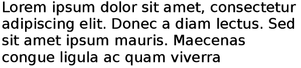
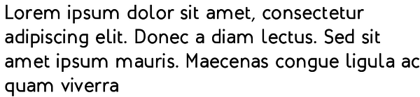
Cantarell

Cantarell is the default font for GNOME 3. Early versions were criticized for poor letter spacing, but the current version has overcome such problems and has an understated elegance that works on paper as well as online.
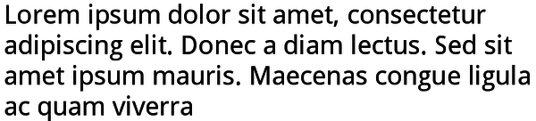
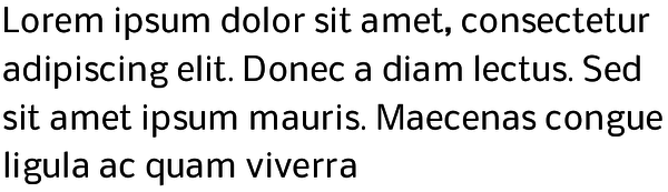
DejaVu Sans
The DejaVu font families are free-licensed versions of Bitstream Vera. One of the earliest free-licensed fonts, the DejaVu fonts are a popular choice for desktop environments. DejaVu Sans is especially useful on line, because characteristics like high letter heights, regular character strokes, and round letters make it highly readable under all circumstances. When printed, it benefits from extra line spacing because its letters are so large that they leave almost no white space.
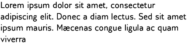
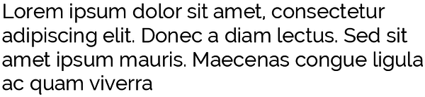
Droid Sans
Droid Sans was designed by Google for mobile devices. As a result, it is ideal for online display, and highly readable at font sizes below 12 points.
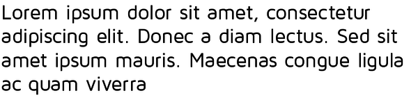
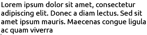
Gillius ADF
Gillius is a free-licensed version of Gills Sans, one of the most versatile and popular fonts of all times. Its characters take up just about the exact same space as their equivalents in Gill Sans, but are darker and more widely spaced. Consider reducing the space between characters when using it.
Lato

Lato is the name for a collection of fonts: Lato, Lato Black, and Lato Hairline. Lato Hairline is too thin for everyday uses, but, between Lato and Lato Black, you should be able to find a font for every purpose. In fact, just as printers used to say about Caslon, I am tempted to say that, when in doubt, use Lato.
Maven Pro
The default line spacing of Maven Pro makes it a sans serif that works successfully as body text. Some might find the variation in its lower case letters original, while others might say that it gives a flattened appearance on both the top and bottom of some letters.
Mint Spirit 2
Mint Spirit 2 was designed unofficially for the Linux Mint distribution. It is a more subdued version of Mint Spirit, which is characterized by outsized capital letters, including a rounded capital M and N. By contrast, Mint Spirit 2 is more subdued. It is ideal for desktops and titles, but is a little too crowded for body text.
Nobile
At body text size -- that is, 10-14 points -- Nobile looks condensed and can even be difficult to ready, because the ascender strokes in letters like "d" or "t" are only slightly larger than letters like "x" or "m" and the crossbars of its "t' and "f" are no wider than they have to be However, this problem disappears at heading and title sizes, at Nobile becomes an font with interesting eccentricities.
Oxygen Sans

Oxygen is the official font of KDE Plasma. As you might expect from KDE's geometric wallpaper, Oxygen uses a number of simple shapes -- for example, "d" and "p" are mirror images of each other. It works at almost any size, but stands out at smaller sizes, and its letters are well-spaced. It works well with Oxygen Mono, but its own italic is angled so much that it is difficult to read.
Raleway
Raleway is ideal for titles and headers. Although it has a range of weights, only the Light, Regular, and Semi-bold should be used in most cases; Thin is almost invisible even on paper, while Heavy's letters are so thick that the spacing between them almost disappears.
Ubuntu
The Ubuntu fonts were professionally designed for Ubuntu's Unity desktop. The basic font is one of the success free-licensed fonts, and its original touches, such as the right side-only crossbars on the "t" and "f" and the combination of a curved and straight side on the "u" give it an elegant individuality. Similarly, its italic is one of the few oblique fonts that are not just the regular weight tilted twenty-five degrees.
By contrast, Ubuntu Mono has several letters like the "m" that look like they have been through a garbage compactor, while Ubuntu Condensed fails to compensate for the reduced space between letters by larger, spiky lower case letters. Both should be avoided.
Fonts for all occasions
The selection of free-licensed serif fonts can be limited, particularly if you anything except a classic body text. By contrast, the designers of free-licensed serif fonts offer a more versatile selection. Besides the eleven here, I would also recommend sans serifs like Fira, FuturaRenner, HammerSmithOne, Istok and League Spartan. However you look at them, free-licensed sans serifs offer enough variety to suit almost any design.
Subscribe to our Linux Newsletters
Find Linux and Open Source Jobs
Subscribe to our ADMIN Newsletters
Support Our Work
Linux Magazine content is made possible with support from readers like you. Please consider contributing when you’ve found an article to be beneficial.

News
-
Linux Servers Targeted by Akira Ransomware
A group of bad actors who have already extorted $42 million have their sights set on the Linux platform.
-
TUXEDO Computers Unveils Linux Laptop Featuring AMD Ryzen CPU
This latest release is the first laptop to include the new CPU from Ryzen and Linux preinstalled.
-
XZ Gets the All-Clear
The back door xz vulnerability has been officially reverted for Fedora 40 and versions 38 and 39 were never affected.
-
Canonical Collaborates with Qualcomm on New Venture
This new joint effort is geared toward bringing Ubuntu and Ubuntu Core to Qualcomm-powered devices.
-
Kodi 21.0 Open-Source Entertainment Hub Released
After a year of development, the award-winning Kodi cross-platform, media center software is now available with many new additions and improvements.
-
Linux Usage Increases in Two Key Areas
If market share is your thing, you'll be happy to know that Linux is on the rise in two areas that, if they keep climbing, could have serious meaning for Linux's future.
-
Vulnerability Discovered in xz Libraries
An urgent alert for Fedora 40 has been posted and users should pay attention.
-
Canonical Bumps LTS Support to 12 years
If you're worried that your Ubuntu LTS release won't be supported long enough to last, Canonical has a surprise for you in the form of 12 years of security coverage.
-
Fedora 40 Beta Released Soon
With the official release of Fedora 40 coming in April, it's almost time to download the beta and see what's new.
-
New Pentesting Distribution to Compete with Kali Linux
SnoopGod is now available for your testing needs