Convert data to diagrams with yEd
Written Material
In the next step, you can label the existing symbols if necessary. To do this, first click the element you want to label with the right mouse button and select Add Label in the context menu. The editor now opens a box with a red outline above the symbol in which you can enter the text. Pressing Enter tells the yEd tool to center the string above the element. Alternatively, you can enter the text in the context-dependent Properties | General Text area.
You can position the box with the text freely with respect to the element. To do so, left-click the label outside of the symbol to tell the software to switch to editor mode. The program shows this change as a double outline. Next, move the box by dragging it to the desired location.
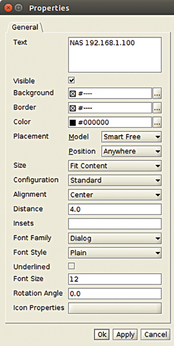
The application displays grid lines that make it easy to adjust the frame with respect to the symbol (e.g., centering it below the element). Then, right-click within the frame and select Properties in the context menu. The editor will now open another window with formatting buttons (Figure 3).
When you enter text with the Add Label option, yEd shows you the entire content you enter in a single line; this can appear very clumsy, especially if you have entered a long piece of text. However, you can use the Text dialog box in the General tab to enable line breaks so that your text input adapts to the length of the symbol.
Layout
Even simple charts can be rather confusing if they have many nodes and you design them without an underlying structure. To solve this problem, the program offers a variety of automatic layout solutions. Once you have completed a chart, you can change the layout by calling one of the options in the Layout menu, which you will find in the menubar at the top of the program window.
After clicking on one of the alternatives available there, yEd opens a window in which you can set various parameters. To confirm, click Ok at the bottom left in the window. The program then arranges the content according to your specifications. yEd offers many layout options, and nearly all of these options offer many additional settings for individual elements, so it is worthwhile experimenting with the alternatives.
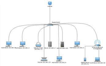
To restore to the state before a change was made in a chart, select Undo, the first entry in the Edit menu. The program then shows the original chart in the editor again. If the chart is too big for a complete view, you can customize the size using the zoom function, so that you can see the entire chart. The Show entire graph switch in the button bar supports automatic scaling (Figure 4).
Once you have found a suitable structure via the layout function, you can still adjust the individual elements if necessary. To help you do so, the software provides a function for defining a grid for the work area. This helps you more easily align each symbol. Select the grid by clicking the Grid button in the tool bar.
Lined Guide
Especially in large charts with many intersecting lines between nodes, it is often easy for the viewer to lose track of the paths. To remedy this, yEd offers a function for automatic routing of the existing lines. Again, you can choose between different modes and experiment until the result satisfies your expectations.
You can access this tool in the Layout | Edge Routing menu. In the corresponding submenu, click the desired line and then configure the required settings in the dialog. Besides setting the distances between individual lines, you can also define a distance between the nodes and specify whether the software also adjusts the labels. The number of existing intersections is another parameter you can set in the dialogs.
After pressing Ok, the software makes the changes. You should still check the results, especially for complex charts: Overlapping lines and labels will typically occur in the context of captions on central nodes. It is advisable to move the text blocks of the nodes manually in this case (Figure 5).
« Previous 1 2 3 Next »
Buy this article as PDF
(incl. VAT)
Buy Linux Magazine
US / Canada
UK / Australia
Subscribe to our Linux Newsletters
Find Linux and Open Source Jobs
Subscribe to our ADMIN Newsletters
Support Our Work
Linux Magazine content is made possible with support from readers like you. Please consider contributing when you’ve found an article to be beneficial.

News
-
TUXEDO Computers Unveils Linux Laptop Featuring AMD Ryzen CPU
This latest release is the first laptop to include the new CPU from Ryzen and Linux preinstalled.
-
XZ Gets the All-Clear
The back door xz vulnerability has been officially reverted for Fedora 40 and versions 38 and 39 were never affected.
-
Canonical Collaborates with Qualcomm on New Venture
This new joint effort is geared toward bringing Ubuntu and Ubuntu Core to Qualcomm-powered devices.
-
Kodi 21.0 Open-Source Entertainment Hub Released
After a year of development, the award-winning Kodi cross-platform, media center software is now available with many new additions and improvements.
-
Linux Usage Increases in Two Key Areas
If market share is your thing, you'll be happy to know that Linux is on the rise in two areas that, if they keep climbing, could have serious meaning for Linux's future.
-
Vulnerability Discovered in xz Libraries
An urgent alert for Fedora 40 has been posted and users should pay attention.
-
Canonical Bumps LTS Support to 12 years
If you're worried that your Ubuntu LTS release won't be supported long enough to last, Canonical has a surprise for you in the form of 12 years of security coverage.
-
Fedora 40 Beta Released Soon
With the official release of Fedora 40 coming in April, it's almost time to download the beta and see what's new.
-
New Pentesting Distribution to Compete with Kali Linux
SnoopGod is now available for your testing needs
-
Juno Computers Launches Another Linux Laptop
If you're looking for a powerhouse laptop that runs Ubuntu, the Juno Computers Neptune 17 v6 should be on your radar.