Graphing the pandemic with open data
Plotting the Data
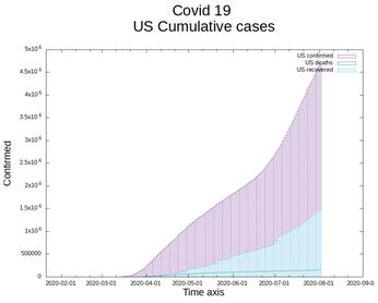
Tabular data is actually very dense and conveys a lot of information, however, it does have the side effect of being rather dry, and when the volume of data is too great, it can be difficult to spot trends. I remembered the graphing tool gnuplot [6], which I have used in the past to give data a friendlier look (Figure 1).
Gnuplot is a cross-platform 2D and 3D graphing tool. You can use gnuplot to create line graphs, bar charts, histograms, or even candlestick charts.
Gnuplot is a command-line program that can accept its input via a pipe and send its output to standard output. The output from gnuplot can be redirected to a file, but it is also possible to define where the output should be written.
Gnuplot is available in the package repositories of many popular Linux distributions:
sudo apt-get install gnuplot
Despite the name, gnuplot is not affiliated with the GNU project, and, although it is free to use and redistribute, it has an unusual license. Because of this license, it is not possible to redistribute modified versions of the source code: "Modifications are to be distributed as patches to the released version." It is still possible to release your own modified binaries of gnuplot, well, with a few conditions that are covered in the copyright [7] statement.
Gnuplot makes it possible to save your graphed output in quite a few different formats. You can save the output in all the common graphic file formats – PNG, GIF, JPEG, and SVG, but also other unusual types of output such as as a Postscript, PDF, or LaTeX file.
When you start gnuplot as a command interpreter, it creates a graphical window where your graphed data will be displayed. Thus you can interactively test out some plotting options (Figure 2).

One of the additional advantages to running gnuplot as an interpreter is that, once you are satisfied with the results, you can save the plot datafile. Conversely you can also load a datafile into the interpreter.
load "plotcommands.ext"
save "plotcommands.ext"
The actual script for generating graphs from the collected data is quite short (Listing 3). This script actually demonstrates how powerful gnuplot is. The main steps for drawing any graph are:
- defining the units on the X and Y axis
- labeling the axis
- plotting the data
These steps are all depicted in Listing 3.
Listing 3
graphs.gp
01 # Reset all plotting variables to their default values.
02 reset
03 clear
04
05 # set the terminal type (ie output format)
06 # also set the width and height
07 set term png size 1000, 800
08
09 # set x & y axis description
10 set xlabel font ",20" "Time axis"
11 set ylabel font ",20" "Confirmed"
12
13 # setup x and y axis values
14 set xdata time
15 set timefmt "%Y-%m-%d"
16 set xrange [ "2020-01-22":* ]
17 set format x "%Y-%m-%d"
18 set yrange [ 0:* ]
19
20 # graph of usa graph
21 set output 'country.png'
22 set title font ",30" "Covid 19 \nUS Cumulative cases"
23 plot "covid19_USA.data" using 1:2 title 'US confirmed' with boxes, \
24      "" using 1:3 title 'US deaths' with boxes, \
25      "" using 1:4 title 'US recovered' with boxes
26
27
28 # graph of minnesota statistics
29 set output 'statemn.png'
30 set title font ",30" "Covid 19 \nMN Cumulative cases"
31 plot "covid19_mn.Data" using 1:2 title 'positive' , \
32      "" using 1:3 title 'hospitalized' , \
33      "" using 1:4 title 'deaths'
34
35
36 # set legend below the graph
37 set key below font ",15"
38
39 # compare a few states against each other
40 set output 'statecompare.png'
41 set title font ",30" "Covid 19 \nPositive Tests"
42 plot "covid19_mn.Data" using 1:2 title 'Minnesota' , \
43      "covid19_ca.Data" using 1:2 title 'California' , \
44      "covid19_ia.Data" using 1:2 title 'Iowa' , \
45      "covid19_mo.Data" using 1:2 title 'Missouri' , \
46      "covid19_mt.Data" using 1:2 title 'Montana'
47
48
49 # compare USA against other countries
50 set output 'confirm.png'
51 set title font ",30" "Covid 19 \nInternational confirmed cases"
52 plot "covid19_USA.data" using 1:2 title 'USA' , \
53      "covid19_DEU.data" using 1:2 title 'DEU' , \
54      "covid19_ESP.data" using 1:2 title 'ESP' , \
55      "covid19_GBR.data" using 1:2 title 'GBP'
The plot statement in Listing 3 is a bit confusing until you recognize that each set of data can come from a different file, and using 1:2 means that column 1 from the data file will be on the X axis and column 2 will be on the Y axis.
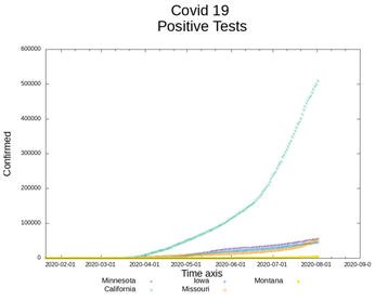
The comparative graph of the individual state infections, Figure 3, is much more helpful than viewing all the US figures in tabular form.
Conclusion
The scripts described in this article are available at the Linux Magazine website [8]. I could have gone even further and collected information from the Twitter accounts of state governors and health departments [9], but I don't think important health information can be summarized into 288 characters. Besides, I am not the biggest follower on Twitter.
Infos
- CovidAPI Project: https://covidapi.info/
- Johns Hopkins Coronavirus Resource Center: https://coronavirus.jhu.edu/
- CovidAPI Documentation: https://documenter.getpostman.com/view/2568274/SzS8rjbe?version=latest#intro
- ISO country codes: https://en.wikipedia.org/wiki/List_of_ISO_3166_country_codes
- Covid Tracking Project: https://covidtracking.com/
- gnuplot: http://www.gnuplot.info/
- gnuplot copyright: https://sourceforge.net/p/gnuplot/gnuplot-main/ci/master/tree/Copyright
- Scripts used in this article: ftp://ftp.linux-magazine.com/pub/listings/linux-magazine.com/240/
- Twitter account information: https://covid-19-apis.postman.com/
« Previous 1 2
Buy Linux Magazine
US / Canada
UK / Australia