Creating charts with LibreOffice Calc
Plotting and Data Visualization
Everybody needs charts sooner or later, and LibreOffice Calc is the easiest way to create them with free and open source software.
Modern life is full of numbers. Even if one is not a mathematician, sooner or later comes the day when it's necessary to quickly understand or share with others the relationships among numbers. This tutorial introduces what is probably the simplest way to do just that with free software, the charts in LibreOffice Calc [1]. But are they charts or graphs? Let's clear up that question first.
Charts vs. Graphs
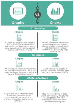
Both charts and graphs are tools to summarize and present information in a visual way. While most people use the two terms as if they were synonyms, strictly speaking, they aren't [2]. Some of the reasons are shown in Figure 1, but basically charts summarize datasets in ways that are (hopefully) intuitive and engaging, for example, with bars, pies, or other symbols. The primary purpose of charts is to convey the high-level meaning of data and the connections within it.
[...]
Buy this article as PDF
(incl. VAT)