Advanced Layout with LibreOffice Writer
Looking Your Best on Paper
BySome documents deserve extra attention to design and typographic detail.
LibreOffice Writer does not default to advanced typography, probably because several decades of word processors has allowed a more relaxed standard for most documents. However, the days of indicating italics by underlining – a relic of the limitation of typewriters – are long past. Although most users are unaware of the fact, Writer can format text almost as well as a professional print shop. With a few default settings and some care, Writer becomes more of a desktop publisher than a word processor, transforming your documents so your words are presented to maximum advantage.
Setting Advanced Options
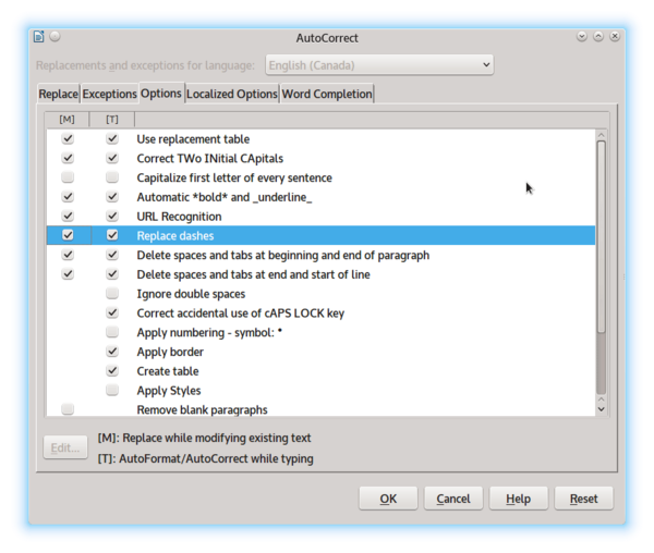
If you want to produce professional-looking documents in Writer, start with the options in Tools | AutoCorrect Options. In addition to numerous time-saving options, the Options tab has a checkbox to Replace dashes (Figure 1). This option automatically corrects the common habit of replacing two hypens with an en dash (see below for comments on whether you should use this feature). Another useful option, this time on the Localized Options tab, are checkboxes for replacing single and double straight quotes (' and ") with rounded smart quotes (‘ and “), of the kind used in professional publishing.
If you are using paragraph styles (and if you are interested in formatting well, you ought to be), you can control hyphenation of lines from each style’s Text Flow tab. You can usually leave the defaults of two characters at the end and start of a line, but you also should set Maximum number of consecutive hyphens to 2, which is the typographical norm (Figure 2).
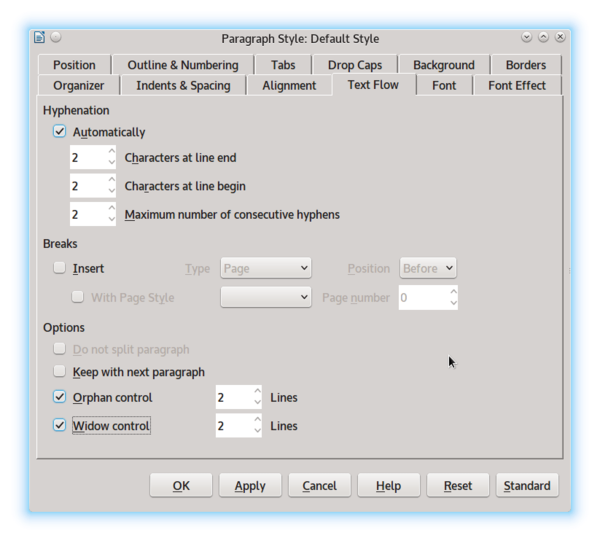
While on the Text Flow tab, you should also enable the defaults of 2 for both widows (lines in a paragraph that fall at the top of the page) and orphans (lines in a paragraph stranded at the bottom of the page). If you are using a Justified alignment, which fills the entire space between the left and right margins, adding spacing as needed, you should also check that the Last line option on the Alignment tab is set to Left; otherwise, a short last line will have huge gaps between characters and words.
Hidden elsewhere in the menu are features for controlling hyphenation at the end of the line. These features are especially useful if your document has a Justified alignment so that you can hand correct awkward spacing. Insert | Formatting Mark has a submenu from which you can either prevent a line break with a Non-breaking space or a Non-breaking hyphen, or else force a hyphenated line break with an Optional hyphen.
Later, as you are putting the finishing touches on a document, run Tools | Language | Hyphenation just as you would Tools | Spelling and Grammar. The automated hyphenation does its best, but after you are finished rearranging text, it may not be optional, and running Hyphenation allows you to improve its best guesses.
Best Practices
Other advanced typography depends on the choices you make while formatting. Ideally, you want to use fonts that include these advanced features. Even better, you want to use fonts that are Graphite-enabled, and will add these features automatically without any extra effort if you have the Typography Toolbar extension installed (Figure 3). Unfortunately, only a few fonts are Graphite-enabled, which means that you may have to insert features manually using Insert | Special Character or by choosing a font style from the Font tab of a Character style.

Formatting features in the Typograph Toolbar that you might want include:
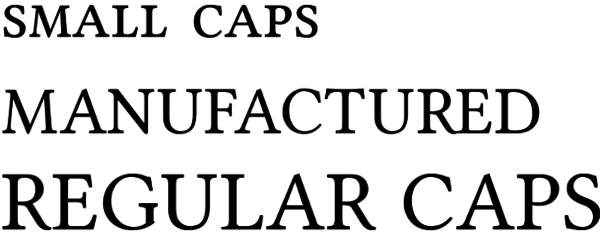
- Small Capitals. Small caps are a font style or separate font designed completely separately from normal capital letters (Figure 4). They are used whenever more than one capital letter appears in a row, such as in abbreviations, because they fit into the rest of the text better. If your fonts lack small capitals, you can sometimes create your own with a special character style, but never use the small caps created automatically from Font Effects | Effects | Small capitals – they are an awkward kludge that looks nothing like either normal capitals or small capitals.
- Ligatures. Ligatures are special characters used to replace common combinations of letters with either awkward or poor spacing, such as ll or ff (Figure 5). The Typographical toolbar has separate buttons for Standard ligatures, Historic ligatures (apparently, overly elaborate ones), and Discretionary ligatures (apparently, ones that not everyone will want), although which ligatures belong to which class is not always obvious. Ligatures do not exist with monspaced fonts, for the simple reason that, when all letters occupy the exact same space, by definition there is no variable spacing that can be tweaked. However, even in variable spaced fonts, not every awkward combination of letters has a ligature to replace it, and some combinations are only awkward with a particular font. In these cases, you can create a character style From Format | Character | Position | Spacing to alter the spacing between selected letters.

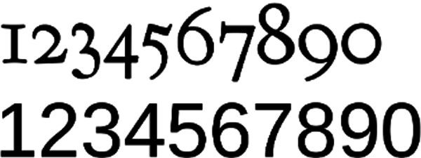
- Old-Style Figures. Today, we are used to using numerals that have a common baseline. These numerals are known as ranging figures or proportional numbers. By contrast, each old-style figure has its own baseline (Figure 6). Old-style figures are considered more suitable for text, and work especially well with small capitals. The only trouble is, the shifting baseline can be confusing to modern readers, especially in tables and spreadsheets, and can appear awkward beside regular capitals. For these reasons, the decision to use old-style figures should be on a font-by-font basis and not made simply because of the idea that they are more elegant.
- Diagonal and Nut Fractions. Fractions are often written with three separate characters: the numerator, a dividing forward slash, and the denominator. This practice is quick and convenient, but not easy to read. Diagonal and nut fractionsreplace these three characters with a single character. A diagonal fraction uses a forward slash to separate the numerator and denominator, whereas a nut fraction uses a horizontal line. Generally, both types are available only for common fractions like one-half and one-quarter. You might also want to avoid them when using a font of eight points or less, in which they might be too small for easy reading.
- Em and En Dashes. As the names suggest, an em dash occupies the space of a letter m, and an en dash the space of a letter n. The two dashes are often used interchangeably to set off an aside from the rest of the sentence. Just as often, two en dashes are used as a quick alternative to an em dash, and, as already noted, LibreOffice can automatically correct two hyphensto an en dash. However, some typographers consider an em dash inelegantand prefer to use an en dash with a space on either side of it instead. An en dash is also used to separate a range of numbers – for instance 3–4pm. It is distinct from both a hyphen and a minus sign, although in casual usage, they are usually lumped together because they look similar.
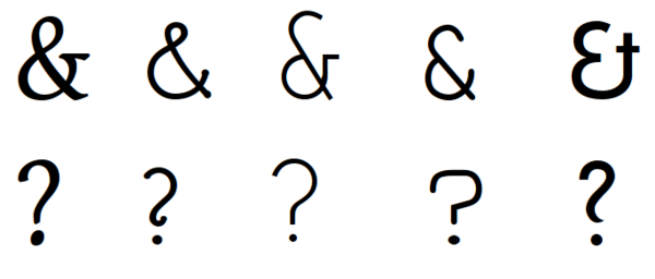
- Borrowed Characters. Sometimes, designers choose to replace a font’s characters like ampersands (&) or question marks (?) with more stylist versions from another font. Nothing is wrong with this practice, and the variations on what most people imagine are standard characters are surprising in number (Figure 7). The substitution can be made through the creation of a Character style, but remember: A little can go a long way. Usually, the result is less overwhelming if only one or two substitutions are made. In the same way, you may not want to use the italic or oblique style designed to accompany a regular font style. Sometimes, an italic is unimaginative, while an oblique style is simply the regular style given an angle of 45 degrees, a horror of an afterthought that is not sufficiently redesigned. Because an italic or oblique can look very different from a font’s regular style, these substitutions are often easy to make.
Your Best Foot Forward
Some users might wonder what the point of advanced typography might be. Generations of typewriter users created conventions that were convenient but inelegant compared with typographical best practices. Moreover, the original Linux users were developers, which created a different set of priorities geared to working on the command line.
Those raised with these conventions might argue that they are good enough and that advanced typographical standards serve no purpose. And for quick, one-time documents, they are often right. However, if you are arguing a point of view or writing a document that will be used for years, a layout that makes for easy reading and is pleasantly designed becomes more important. An advanced design reflects on you and your thoughts, so the time taken to look your best is never wasted.