Getting started with the R data analysis language
RStudio Scripts
A script is a plain text file in which you store the R code. You can open a script file in RStudio via the File menu.
RStudio has many built-in features that make working with scripts easier. First, you can run a line of code automatically in a script by clicking the Run button or pressing Ctrl+Enter. R then executes the line of code in which the cursor is located. If you highlight a complete section, R will execute all the highlighted code. Alternatively, you run the entire script by clicking the Source button.
Data Analysis
A typical process in data analysis involves a series of phases. The primary step in any data science project is to gather the right data from various internal and external sources. In practice, this step is often underestimated – in which case problems arise with data protection, security, or technical access to interfaces.
Data cleaning or data preparation is a critical step in data analysis. The data collected from various sources might be disorganized, incomplete, or incorrectly formatted. If the quality of the data is not good, the findings will not be of much use to you later on. Data preparation usually takes the most time in the data analysis process.
After cleaning up the data, you need to visualize the data for a better understanding. Visualization is usually followed by hypothesis testing. The objective is to identify patterns in the dataset and find important potential features through statistical analysis.
After you draw insights from the data, a further step typically follows: You will want to predict how the data will evolve in the future. Prediction models are used for this purpose. Historical data is divided into training and validation sets, and the model is trained with the training dataset. You then verify the trained model using the validation dataset and evaluate its accuracy and efficiency.
Data Visualization
R has powerful graphics packages that help with data visualization. These tools produce graphics in a variety of formats, which can also be inserted into documents of popular office suites. The formats include bar charts, pie charts, histograms, kernel density charts, line charts, box plots, heat maps, and word clouds.
To quickly generate a couple of plots using the previously installed ggplot2 package, first create two vectors of equal length. The first is a set of x-values; the second is a set of y-values. Next, square the values of the x vector to generate the values for the y vector, and finally output the graph (Listing 2).
Listing 2
Sample Graph
> x <- c(-1, -0.8, -0.6, -0.4, -0.2, 0, 0.2, 0.4, 0.6, 0.8, 1)
> y <- x^2
> qplot(x, y)
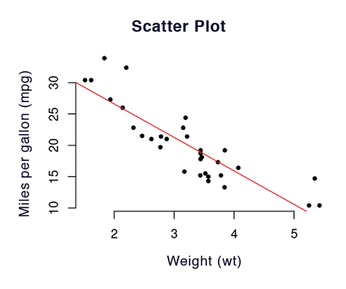
The scatter plot is one of the chart types commonly used in data analysis; you can create a scatter plot using the plot(x, y) function. You can pass in other parameters, such as main for the header input, xlab for the x-axis labels, and ylab for the y-axis labels. Listing 3 uses a dataset supplied by R from the US magazine Motor Trend in 1974, covering 10 aspects of 32 vehicle models, including number of cylinders, vehicle weight, and gasoline consumption. Load the dataset by typing:
data(mtcars
Listing 3
Vehicle Data Example
> plot(mtcars$wt, mtcars$mpg, main = "Scatter chart", xlab = "Weight (wt)", ylab = "Miles per gallon (mpg)",
    pch = 20, frame = FALSE)
> fit <- lm(mpg ~ wt, data=mtcars)
> abline(fit, col="red")
The command head(mtcars) then displays the first six lines.
Use the abline() function to add a regression line to the graph (Figure 3). To do this, lm() first calculates the linear regression between the range and the weight, which shows that there is a relationship. This is a negative correlation: The lighter a vehicle is, the farther it can travel on the same amount of gasoline. The graph says nothing about the strength of the relationship, but summary(fit) provides a variety of characteristic values of the calculation. This includes a fairly high R-squared value, a statistical measure of how close the data points are to the regression line.
Histograms visualize the distribution of a single variable. A histogram shows how often a certain measured value occurs or how many measured values fall within a certain interval. The qplot command automatically creates a histogram if you only pass in one vector to plot. qplot(x) creates a simple histogram from x <- c(1, 2, 2, 3, 3, 4, 4, 4).
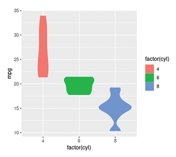
The box plot, also known as a whisker diagram, is another type of chart. A box plot is a standardized method of displaying the distribution of data based on a five-value summary: minimum, first quartile (Q1), median, third quartile (Q3), and maximum. In addition, a box plot highlights outliers and reveals whether the data points are symmetrical and how closely they cluster.
In R you can generate a box plot, for example, with qplot(). The best way to generate a box plot is with the sample data from mtcars. To use the cyl column as a category, factor() first needs to convert the values from numeric variables to categorical variables. This is done with the factor() command (Listing 4).
Listing 4
Box plots
> qplot(factor(cyl), mpg, data = mtcars, geom = "violin", color = factor(cyl), fill = factor(cyl))
Thanks to the special display form that the geom="violin" parameter sets here, you can see at first glance that, for example, the vast majority of eight-cylinder engines can travel around 15 miles on a gallon of fuel, whereas the more frugal four-cylinder engines manage between 20 and 35 miles with the same amount (Figure 4).
« Previous 1 2 3 4 Next »
Buy this article as PDF
(incl. VAT)
Buy Linux Magazine
US / Canada
UK / Australia
Subscribe to our Linux Newsletters
Find Linux and Open Source Jobs
Subscribe to our ADMIN Newsletters
Support Our Work
Linux Magazine content is made possible with support from readers like you. Please consider contributing when you’ve found an article to be beneficial.

News
-
OSJH and LPI Release 2024 Open Source Pros Job Survey Results
See what open source professionals look for in a new role.
-
Proton 9.0-1 Released to Improve Gaming with Steam
The latest release of Proton 9 adds several improvements and fixes an issue that has been problematic for Linux users.
-
So Long Neofetch and Thanks for the Info
Today is a day that every Linux user who enjoys bragging about their system(s) will mourn, as Neofetch has come to an end.
-
Ubuntu 24.04 Comes with a “Flaw"
If you're thinking you might want to upgrade from your current Ubuntu release to the latest, there's something you might want to consider before doing so.
-
Canonical Releases Ubuntu 24.04
After a brief pause because of the XZ vulnerability, Ubuntu 24.04 is now available for install.
-
Linux Servers Targeted by Akira Ransomware
A group of bad actors who have already extorted $42 million have their sights set on the Linux platform.
-
TUXEDO Computers Unveils Linux Laptop Featuring AMD Ryzen CPU
This latest release is the first laptop to include the new CPU from Ryzen and Linux preinstalled.
-
XZ Gets the All-Clear
The back door xz vulnerability has been officially reverted for Fedora 40 and versions 38 and 39 were never affected.
-
Canonical Collaborates with Qualcomm on New Venture
This new joint effort is geared toward bringing Ubuntu and Ubuntu Core to Qualcomm-powered devices.
-
Kodi 21.0 Open-Source Entertainment Hub Released
After a year of development, the award-winning Kodi cross-platform, media center software is now available with many new additions and improvements.