A plotting library
Polar Charts
You may be familiar with (and potentially loathe) the final Matplotlib example in this tutorial from performance evaluations: a polar diagram that resembles a radar screen. Figure 9 shows a polar chart with the scores achieved by one or more subjects in a series of activities (aka evaluations).
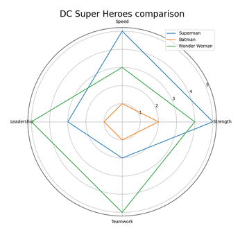
As in some other examples in this tutorial, the plotting part of Listing 11 (lines 11 to 19) is easier to explain than the portion that provides the data. Line 14 defines this diagram as polar, instead of using a Cartesian coordinate system like the other diagrams. Line 11 declares that there must be five labels (the length of the superhero_1 array), located at equal intervals along the entire circumference (which is long pi times two), and line 19 says that the labels to place in those locations are in the categories array. Lines 15-17 add three distinct lines around the diagram, each with its own label, and the numeric values taken by the array of the corresponding superhero, defined in lines 7-9. As a result, Figure 9 shows that Superman has Strength=5 but Teamwork=2, Wonder Woman has Leadership=5, and so on.
Listing 11
Polar Comparison of DC Super Heroes
01 import NumPy as np
02 import Matplotlib.pyplot as plt
03
04
05 categories = ['Strength', 'Speed', 'Leadership', 'Teamwork', '']
06
07 superhero_1 = [5, 5, 3, 2, 5]
08 superhero_2 = [2, 1, 1, 1, 2]
09 superhero_3 = [4, 3, 5, 5, 4]
10
11 label_loc = np.linspace(start=0, stop=2 * np.pi, num=len(superhero_1))
12
13 plt.figure(figsize=(8, 8))
14 plt.subplot(polar=True)
15 plt.plot(label_loc, superhero_1, label='Superman')
16 plt.plot(label_loc, superhero_2, label='Batman')
17 plt.plot(label_loc, superhero_3, label='Wonder Woman')
18 plt.title('DC Super Heroes comparison', size=20)
19 lines, labels = plt.thetagrids(np.degrees(label_loc), labels=categories)
20 plt.legend()
21 plt.savefig('../figures/radar.png')
The most important, but harder to notice, parts of Listing 11 are in lines 5 and 11: If you must only display four parameters (Strength, Speed, Leadership, and Teamwork), why do you need five locations for their labels and, correspondingly, a fifth, empty category ('')? The answer, which can easily be verified by altering those parameters, is that they are needed to "come full circle." Without that extra empty category, each superhero's line would not return to its initial point to close itself, resulting in an uglier diagram.
Conclusion
If you made it this far, you now know enough about Matplotlib to start creating many, wildly different charts and, above all, find your way around Matplotlib's huge documentation without wasting too much time. Happy plotting!
Infos
- Matplotlib: https://matplotlib.org
- Gnuplot: http://www.gnuplot.info
- MATLAB: http://www.mathworks.com/products/matlab.html
- NumPy: http://www.numpy.org
- Pandas: https://pandas.pydata.org
- Pyplot scatter syntax: https://matplotlib.org/3.1.1/api/_as_gen/matplotlib.pyplot.scatter.html
- Sankey diagrams: http://www.ifu.com/e-sankey/sankey-diagram/
- Sankey Matplotlib example: https://Matplotlib.org/stable/gallery/specialty_plots/sankey_basics.html
The Author

Marco Fioretti (http://mfioretti.com) is a freelance author, trainer, and researcher based in Rome, Italy. He has been working with free/open source software since 1995 and on open digital standards since 2005. Marco also blogs about digital rights at https://stop.zona-m.net.
« Previous 1 2 3 4 5
Buy this article as PDF
(incl. VAT)
Buy Linux Magazine
US / Canada
UK / Australia