7 branding fonts for free software

Off the Beat: Bruce Byfield's Blog
Apple has its Myriad, and IBM its Bodoni. In recent years, though, it has been the turn of free software projects to adopt a typeface as part of their identity.
The use of typefaces in branding is nothing new, of course. A consistently used font can immediately suggest a company or group, even to people who have no conscious awareness of typography.
However, such concerns are new to free software. The fact that they are becoming common now reflects, perhaps, the increased interest in design and usability encouraged by major projects like Ubuntu and GNOME. A well-chosen font can both complement a theme and increase legibility on the desktop.
But the best thing about the branding fonts of free software is that project philosophy means that they are released under a free license. Unlike fonts used in proprietary branding, these ones can not only be admired, but used.
Some of the fonts used for project branding are:
Initially designed by Dave Crossland, Cantarell is the default font in GNOME 3.When it was first used in 2010, it was criticized for its incomplete design and lack of support for non-West7ern languages, but subsequent development has improved Cantarell to the point that it is one of the best features in GNOME.
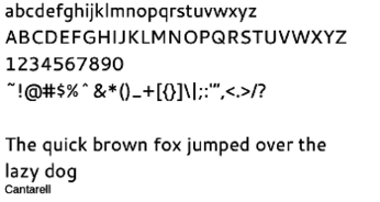
Cantarell features wide characters with well-rounded bowls on letters like "o" or "b," and a broad x-height (the height of "x" or "m"). These features make it legible at small font sizes, making it suitable not only for a desktop but also for features such as captions, headers and footers, and footnotes in any document.
The DejaVu family are a fork of the Bitstream Vera fonts, originally used by GNOME. Available in sans, monospaced, and serif, none of the family members are particularly things of beauty.
But all of the DejuaVu family have two advantages: greater than usual support for Unicode, and large, rounded characters that make for the best legibility of any free font. The family's characters take up so much of the space allotted to them that they can be as much as a third taller in actual height than the same letters in another typeface.
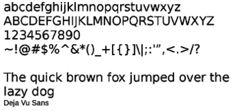
For best results with DejaVu, add a point or two of letter spacing. Otherwise, DejaVu can easily look cramped.
Droid
Droid was released in 2006 by Ascender for use with Android devices. A sans serif, sans mono, and serif version are available as free fonts, with additional proprietary weights such as Handset Condense available from Ascender. Apparently, Ascender is even working on old style figures -- something that even typographers probably see no need for on phones or tablets.
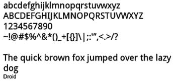
The typeface's website notes that Droid was intended as a design balanced midway between cuteness and technical. The result has its admirers, but, to my eye, the result is a rather characterless font, especially the monspaced weight. It does its job, being readable at low font sizes, but lacks distinction -- and, most of all, elegance.
Fira Sans
Designed for Mozilla's Firefox OS, Fira is a geometric font with several unusual features, including the open-tailed "g," the low ascender of the "t", and the tail of the "l" and the "t" which is lacking on letters like "f", and the slope on the outer strokes of the upper case "M."7
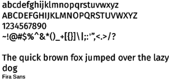
These features are almost unnoticeable when you use the regular weight at normal body text sizes. In fact, you might be tempted to dismiss the typeface used this way as uninspired. However, at sizes above 16 or in the light weight, they look both original and graceful.
Mint Spirit
Hirwen Harendal designed these two typefaces as unofficial branding for the Linux Mint distribution. Both are similar in general letter shapes, but Mint Spirit No2 has slightly tighter spacing between characters, as well as somewhat
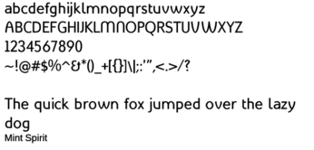
Both versions of the typeface are a combination of varied letter forms, especially Mint Spirit. In Mint Spirit, the "f' has a full cross-bar, the "t" ony half a one, and the "m" and "w"have rounded strokes reminiscent of an Arts and Crafts or Art Nouveau typeface. These features are especially pronounced in the upper case letters, as well as the ampersand (&) and question mark.
By contrast, Linux Mint No2 eliminates much of the roundness except in upper case letters like "C" or "O." The tamed-down second version is probably more of an all-purpose font, but the first is more elegant.
Oxygen
Oxygen is a typeface-in-progress, scheduled to become the default font of KDE's next-generation interface. Its name suggests that it is meant to be used with the Oxygen theme and icon sets.
Currently available in regular, bold, and monospace, Oxygen is a geometric font, with simple shapes, but enough variation to avoid looking too rigid (look, for example, at the difference between the lower case "a" and the bottom of the "b").
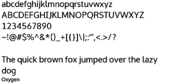
I have heard a few users complain that it is too simple, but such an unassuming typeface has the advantage of never calling attention to itself, of doing its job without getting in the way. I suspect that it will wear well when used everyday, at almost any size.
Ubuntu
The Ubuntu typeface was professionally designed for the Unity interface. It feature regular and italic fonts of LIght, Regular, Medium, and Bold, as well as Condensed and Monospaced versions.
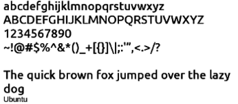
Ubuntu is distinquished by cross-bars on letters like "t" and "f" that extend only to the right, and an x-height so extreme that the ascenders (top strokes) of letters like "b" or "f" are indistinct.
These characteristics make the regular Ubuntu weights distinctive without being eccentric, and useful for titles and headers in a document. Unfortunately, the italics are actually an irregular combination of italic and oblique characters Even worse, the condensed weights are illegible at smaller sizes and look cramped and narrow at more than 18 points. Stick with the regular and monospaced weights when using this typeface.
Borrowing from a brand
A possible drawback to using most of these fonts is that you risk your work being identified with the project that created them.
Still, even the best-known of these brands is hardly Coca-Cola or Toyota. I have had one client who was indifferent enough to the risk to choose Fira as a corporate font, and I suspect that others may feel the same.
Besides, being associated with free software, the fonts may have less stigma than those used by proprietary brands.
The truth is, despite the upsurge in free fonts in the last few years, we still have only a small collection of quality choices. Many of these fonts, at least in specialized contexts, are simply too tempting to ignore.
comments powered by DisqusSubscribe to our Linux Newsletters
Find Linux and Open Source Jobs
Subscribe to our ADMIN Newsletters
Support Our Work
Linux Magazine content is made possible with support from readers like you. Please consider contributing when you’ve found an article to be beneficial.

News
-
Kali Linux Waxes Nostalgic with BackTrack Mode
For those who've used Kali Linux since its inception, the changes with the new release are sure to put a smile on your face.
-
Gnome 50 Smooths Out NVIDIA GPU Issues
Gamers rejoice, your favorite pastime just got better with Gnome 50 and NVIDIA GPUs.
-
System76 Retools Thelio Desktop
The new Thelio Mira has landed with improved performance, repairability, and front-facing ports alongside a high-quality tempered glass facade.
-
Some Linux Distros Skirt Age Verification Laws
After California introduced an age verification law recently, open source operating system developers have had to get creative with how they deal with it.
-
UN Creates Open Source Portal
In a quest to strengthen open source collaboration, the United Nations Office of Information and Communications Technology has created a new portal.
-
Latest Linux Kernel RC Contains Changes Galore
Linux kernel 7.0-rc3 includes more changes than have been made in a single release in recent history.
-
Nitrux 6.0 Now Ready to Rock Your World
The latest iteration of the Debian-based distribution includes all kinds of newness.
-
Linux Foundation Reports that Open Source Delivers Better ROI
In a report that may surprise no one in the Linux community, the Linux Foundation found that businesses are finding a 5X return on investment with open source software.
-
Keep Android Open
Google has announced that, soon, anyone looking to develop Android apps will have to first register centrally with Google.
-
Kernel 7.0 Now in Testing
Linus Torvalds has announced the first Release Candidate (RC) for the 7.x kernel is available for those who want to test it.