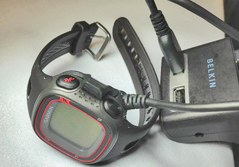
Reading data from GPS devices

Invisible Pacemaker

Once I have the YAML data, I can easily write applications in Perl and other languages that interpret the stored GPS data. One feature I really miss with my Garmin 10 (and that my previously used Garmin Forerunner 101 had) is the so-called Virtual Partner.

With this feature, runners can program in the speed of a virtual pacesetter, who runs at constant speed and crosses the finish line at precisely the expected time by definition. During the run, the GPS device indicates how far the virtual runner's legs have taken them. If the pacemaker is 100 yards ahead, I need to speed up, if it drops back, I can slow down, and if we are jogging together, I am sure to finish on time.

Listing 3 implements a function to compare two runs in a similar way for my new GPS device. It uses two FIT files converted into YAML format, reads the distance and timestamp entries, and draws a graph with the distances covered by the two runners at specific times. The x-axis shows the elapsed running time in seconds, and the y-axis visualizes the distance covered by the runners in meters.

Listing 3

vrunner


Both FIT files were created during real runs. After my sporting excursion (Figure 2), I completed another training run on the same route. I wanted to find out whether a slightly slower pace in the first few miles would leave me feeling stronger for the final sprint and leave enough breathing room to manage a few hills in between (elevation difference about 300 feet).

The CPAN Imager::Plot module plots the data passed in as an array on the coordinate system and labels the axes nicely. The data_extract() function in line 59 expects a YAML file with the FIT data and returns an array. It contains x/y value pairs of stored combinations of timestamps and distances traveled.

Line 74 removes the unit, m for "meters," from the value for distance, leaving only the numeric value. The variable $base is set to the timestamp of the first entry, so that vrunner can later only add timestamps relative to this base point and append them to the resulting array.

Clockwork Horse

The green graph in Figure 6 shows the first, fast run; the red graph was created after the second, slower run. The comparison shows that I was unable to translate the power reserves gained by the slower starting pace into a faster second half. Once I'm in motion, I seem to run like clockwork – without anyone dangling a carrot in front of my nose, I seem to run no faster than necessary.

Figure 6: The laid-back jogger in red is steadily losing against the runner in flattering green, who is apparently pushing himself to the limit.

The Author

Mike Schilli works as a software engineer with Yahoo! in Sunnyvale, California. He can be contacted at mailto:mschilli@perlmeister.com. Mike's homepage can be found at http://perlmeister.com.

Buy this article as PDF

Express-Checkout as PDF
Price $2.95
(incl. VAT)

Buy Linux Magazine

SINGLE ISSUES
 
SUBSCRIPTIONS
 
TABLET & SMARTPHONE APPS
Get it on Google Play

US / Canada

Get it on Google Play

UK / Australia

Related content

comments powered by Disqus