Setting Type in LibreOffice
Typography of LibreOffice Writer
ByLibreOffice Writer is a serviceable desktop publisher with more typography features than most users imagine.
Years ago, Elizabeth Mathias, an employee of Sun Microsystems, told me a story about StarOffice, the proprietary program that became OpenOffice.org, and later LibreOffice and Apache OpenOffice. According to Mathias, when the Writer module was first developed several decades ago, its programmers were told they would have to use it to document their work. As a result, they made sure that Writer was not simply a word processor, but a layout program as well – to the benefit of free software users ever since. In fact, while not complete, Writer’s features are advanced enough that it should hardly be considered a word processor at all.
Admittedly, the features of Writer often go unnoticed. If you format manually, you may be completely unaware of them. Even if you use styles, you might not have noticed them fully. For most purposes, the average user hardly cares about the length of the line that separates the main body of text and a footnote or the spacing between a bullet and a list item. Most of the time, you can trust the code to have a default that is, if not perfect, at least good enough for your purposes.
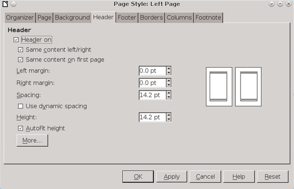
However, if you want to enhance your document, the tools are waiting. Take, for example, the tools for setting up a header in a page style (Figure 1). Once a header is turned on, you can simply select Same content left/right and Same content on first page, and your header is set up. If you want more control, you can give the header separate margins from the main text (Left margin and Right margin), adjust the space between the bottom of the heading and the main text, making it fixed (Spacing) or variable (Use dynamic spacing) or make the height of the header fixed (Height) or variable (Autofit height) as well.
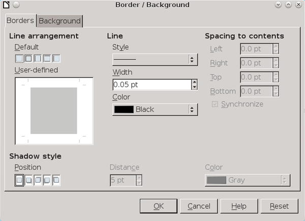
What’s more, that is just the first tab. Click the More… button, and you can surround the header with a border or separate it from the main text with a signal line, while setting the style, thickness, and color, and the distance between the border or box and the header’s contents. You can even customize a shadow to add a 3D effect, although I wouldn’t recommend that feature unless you want a retro 1990s look (Figure 2)
And so it goes for every feature available in Writer. Page margins, tables, text wraps, tables of contents, superscript and subscript letters – almost every aspect has as much degree of choice as you can imagine. At times you might need some ingenuity to get the exact layout you want, but the actual limitations are few. You cannot, for example, create a list style that counts down from 10, but adding one manually is a rare and minor inconvenience at best.
Line Spacing, Kerning, and Hyphenation
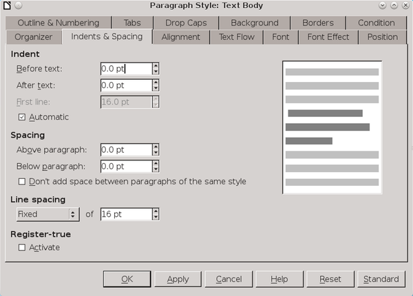
Writers’s customization tools include many features found only in layout programs. Like most word processors, Writer gives you default spacing between lines that are single or double spaced and work reasonably well for many fonts. However, for as many as a third of fonts, this default makes the text appear too light or too dark. When that happens, Writer gives you the alternative of clicking Indents & Spacing | Line spacing | Fixed to adjust the line spacing exactly as a professional publisher would (Figure 3).
Similarly, in some fonts, certain letter combinations make for awkward spacing, such as “Va” or duplicate letters such as “ff” or “tt” (Figure 4) A few fonts have ligatures – letter combinations re-designed as a single character – that can be inserted by clicking Insert | Special Character and making a selection. However, in LibreOffice, you can select Position | Pair kerning in a paragraph to have LibreOffice automatically attempt to improve awkward letter spacing. Better yet, if you want complete control over the adjustments, you can create a character style that uses Format | Character | Position | Spacing to tweak the spacing between characters by increments of one-tenth of a point (i.e., 1/720th of an inch). Perfectionists can even create separate character styles to be used with different combinations of letters.

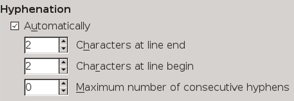
However, the tool that most separates Writer from its rival is probably its hyphenation controls (Figure 5). On the Text Flow tab of any paragraph style, you can set the number of characters that hyphenation places at the end or start of a line, as well as the number of consecutive hyphens permitted (two is the typographical convention).
Like most word processors, Writer will use these settings to create the best hyphenation it can manage as you type. The only trouble is, by the time you finishing editing and revising, the hyphenation is no longer the best possible result. Fortunately, if you have a hyphenation dictionary installed for the language you are using, you can click Tools | Language | Hyphenation to check a document’s hyphenation, positioning hyphens so they fall exactly where you want them (Figure 6). If a poor hyphenation break remains, you can either insert a break manually by pressing Ctrl + – (dash) or prevent a break by listing a word as never to be hyphenated in Tools | Options | Language Settings | Writing Aids. Note that neither of these manual tools functions unless a word falls into the hyphenation range for that paragraph style.
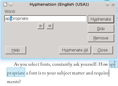
The Hyphenation tool is so useful that LibreOffice users should get in the habit of using it immediately after spell checking on every document. However, the Hyphenation tool is especially useful when you choose to have justified lines, on which the characters fill all the space between the left and the right margin. Left uncorrected, justified lines can leave unsightly irregular spaces either between words or characters, which is why many designers prefer left alignment. With the Hyphenation tool, however, you can usually rid your documents of the irregular spacing so long as you are willing to take the time. The only problem you are likely to have is a short final line in a paragraph, and you can adjust its appearance by setting the paragraph style to Alignment | Justified |Last line Left.
Shortcomings and Workarounds
LibreOffice Writers’s tools are advanced enough that several publishers I know use it to lay out their books. I can also personally attest to the fact that LibreOffice can successfully replace FrameMaker for technical manuals and brochures.
All the same, from a typographer’s viewpoint, Writer does have some shortcomings. For some reason, in the last few versions, you can only set line spacing by whole points, instead of one-tenth points, which may sound adequate but can prevent optimal line spacing. This change is all the more inexplicable because fields such as Font Size still allow the more exact line spacing.
More seriously, Writer does not automatically add many of the finishing details for the absolute highest level of typography, such as the use of ligatures to prevent awkward letter combinations or small capitals instead of uppercase letters, or case fractions instead of built-up fractions (e.g., ½ compared with 1/2). These stylistic flourishes, though, can be set up in Tools | Autocorrect Options and saved in your default template so that they are always available.
One possible future solution is Graphite, a smart font-tool that automatically applies such finishing details. Graphite can be used with Writer by installing the Typography Toolbar extension or by hard-coding features in the Character and Paragraph styles. Currently, though, only a few fonts (e.g., Linux Libertine G) are Graphite-aware, and font designers appear to be in no hurry to change the situation.
Still, such advanced touches are simply difficult, not impossible. In the end, whether you can coax advanced typographical standards out of Writer is very much a case of how dedicated you are. Even if you are unwilling to take such pains, though, LibreOffice Writer remains an intermediate desktop publisher that is far more powerful than most users imagine – and not bad at all for an application whose basic capabilities are 30 years old.
Probably, there is a moral in Mathias’ story, if developers care to find one.