Conditional Formatting in LibreOffice Spreadsheets
Conditional Formatting
ByIntegrate graphical information beside the data it represents with conditional formatting and sparklines.
Spreadsheets are all about detailed data and its manipulation. Sometimes, though, you need a summary for gathering general impressions and discerning trends. That is where conditional formatting becomes useful in LibreOffice Calc – as a graphical summary for interpreting general trends in data at a glance, rather than studying the figures closely.
Contrary to first impressions, Conditional Formatting shares only part of its name with Conditional Fields or Conditional Styles in Writer. All the three features have in common is that their appearance changes depending on context. In the case of conditional formatting, for instance, the format changes when the content of the involved cells changes.
Conditional formatting is an extension of the idea of sparklines, a concept named and popularized by data visualization theorist Edward Tufte, who devotes 20 pages to the concept in his book, Beautiful Evidence. Sparklines are small line graphs that fit on a line of text or a single spreadsheet cell. They contain no figures, but from their shape, you can see the general trends in the data they map.
According to Tufte, the advantages of sparklines are that they:
… vastly increase the amount of data within our eyespan and intensify statistical graphics up to the everyday routine capabilities of the human eye–brain system for reasoning about visual evidence, seeing distinctions, and making comparisons. And data graphics are no longer a special occasion in a separate place with a frame on some slide with a label “Fig. 17-B” …. Providing a straightforward and contextual look at intense evidence, sparkline graphics give us some chance to be approximately right rather than exactly wrong.
Excel supports sparklines, but Calc does not, although some proof-of-concept macros were circulating a few years ago. However, conditional formatting offers several alternatives to sparklines that provide the same visual advantages while adding some complexity to the basic idea.
How Conditional Formatting Works
Conditional formatting in Calc automatically changes the appearance of selected cells. The automatic format can be the application of a cell style or of an indicator that visually presents data in much the same way as a graph or a chart.
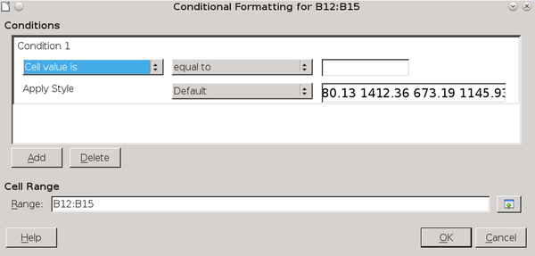
To use Calc’s conditional formatting, select the cells to work with, then click Format | Conditional Formatting | Condition, and select an item from the sub-menu. All types of conditional formatting can be configured from Condition. The Color Scale and Data Bar menu items are short-cuts to options available under Condition. If necessary, you can edit the range of cells affected at the bottom of the Conditions window (Figure 1).
The Conditions window has three fields. From left to right, they are:
- The general condition.
- The filter to refine the condition.
- The numerical value that must be present to activate the conditional formatting.
Below these three fields, you have the option to select a cell style.
By changing the general condition, you can choose the following types of conditional formatting:
- Cell value is: Applies the selected cell style when the numerical value is met. This type is useful for emphasizing target values in a range of cells. It cannot be used for cells formatted for text.
- Formula is: Applies the selected cell style to cells in which the designated formula is used. The formula is typically one that viewers of the sheet want to find easily.
- Date is: Applies the selected cell style to cells in which the designated filter is used, from Today to Last Week. This type is especially useful for locating recent information.
- All Cells | Color Scale (2 entries): Creates a gradient of two colors. The fields refer not to formulas, but to target values. The color scale is especially useful for showing high and low values in a range of cells at a quick glance (Figure 2).

- All Cells | Color Scale (3 entries): Like a color scale for two entries, except that a third target value is added, often a midpoint using the value Percent.
- All Cells | Data Bar: A gradient that creates a graph-like representation, typically showing how far a cell value is above or below a designated norm (Figure 3).

- All Cells | Icon Set: Adds a set of icons to summarize the contents of cells (Figure 4). Available icons include arrows, flags, check marks, bar graphs, emoticons, and quartered circles. Each icon set has three or four icons, each depicting a different state. For example, traffic light icons or emoticons might designate if results were above, below, or equal to projections.

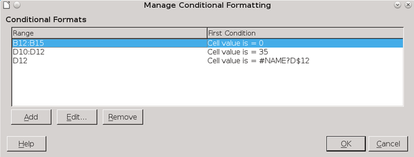
Once you have set conditional formatting, you can select Manage from the sub-menu to see a summary of the instances of Conditional Formats and edit the selections (Figure 5). You might also want to add a caption to the formatted cells to explain what is being displayed.
Adding a Sparkline
If you want a sparkline, you can create one manually following this procedure:
- Highlight the range of cells for the sparkline.
- Select Insert | Object | Chart.
- Create a Line graph. Use the Lines Only sub-type or, if you want to emphasize the points on the graph, the Points and Lines sub-type.
- Remove each element of the chart except the line by deleting it, or setting it to the same color as the background (usually white).
- Select the chart and drag it while pressing the Shift key, so it changes size without distortion (Figure 6).
- Position the line graph by the range of cells it represents.
The sparkline will update if you click it or save and reopen the spreadsheet after changing one or more figures in the range of cells.

New Dimensions to Spreadsheets
Both conditional formatting and sparklines are relatively new concepts. So far as anyone can tell, they appear to be less than 20 years old. As the workaround for sparklines in Calc indicates, they are extensions of charts and graphs, except at a higher level and with less detail. Also, unlike charts and graphs, they are integrated with the data they represent.
Think of them as the graphical equivalent of captions, an annotation that helps you make sense of your data. Even if you do not use Conditional Formatting or sparklines when you first design a spreadsheet, you might decide to add them later, especially in a spreadsheet that has a long, active lifetime.
Subscribe to our Linux Newsletters
Find Linux and Open Source Jobs
Subscribe to our ADMIN Newsletters
Support Our Work
Linux Magazine content is made possible with support from readers like you. Please consider contributing when you’ve found an article to be beneficial.

News
-
Mecha Systems Introduces Linux Handheld
Mecha Systems has revealed its Mecha Comet, a new handheld computer powered by – you guessed it – Linux.
-
MX Linux 25.1 Features Dual Init System ISO
The latest release of MX Linux caters to lovers of two different init systems and even offers instructions on how to transition.
-
Photoshop on Linux?
A developer has patched Wine so that it'll run specific versions of Photoshop that depend on Adobe Creative Cloud.
-
Linux Mint 22.3 Now Available with New Tools
Linux Mint 22.3 has been released with a pair of new tools for system admins and some pretty cool new features.
-
New Linux Malware Targets Cloud-Based Linux Installations
VoidLink, a new Linux malware, should be of real concern because of its stealth and customization.
-
Say Goodbye to Middle-Mouse Paste
Both Gnome and Firefox have proposed getting rid of a long-time favorite Linux feature.
-
Manjaro 26.0 Primary Desktop Environments Default to Wayland
If you want to stick with X.Org, you'll be limited to the desktop environments you can choose.
-
Mozilla Plans to AI-ify Firefox
With a new CEO in control, Mozilla is doubling down on a strategy of trust, all the while leaning into AI.
-
Gnome Says No to AI-Generated Extensions
If you're a developer wanting to create a new Gnome extension, you'd best set aside that AI code generator, because the extension team will have none of that.
-
Parrot OS Switches to KDE Plasma Desktop
Yet another distro is making the move to the KDE Plasma desktop.