Designing cross-platform GUI apps with Fyne
Adding a Widget
In Fyne, an app can be created by drawing basic types (called CanvasObjects) to a position within the window. These items are available in the fyne.io/fyne/v2/canvas package. However, you can use a collection of pre-made widgets (fyne.io/fyne/v2/widget) that provides several interactive widgets for the standard user controls and visual items found in most apps.
You can create a new label widget to display the text "TODO App" by simply calling widget.NewLabel("TODO App"). Then use the SetContent method to place this widget inside the previously created window. The line of code now becomes:
w.SetContent(widget.NewLabel("TODO App"))Finally, you must show the window. Because GUI toolkits also have an event loop that manages how the app runs and listens for user input, you also need to run the app. Conveniently, Fyne has a method that simultaneously shows the window and runs the application:
w.ShowAndRun()
That is all there is to creating your first graphical app.
Running the App
To run the app, you can use go run, or you could build it using go build and then later run the executable that was created. However, because you have added a new library, you should run go mod tidy first to ensure the project metadata is up-to-date. After this, you can run the app with:
> go mod tidy
go: finding module for package fyne.io/fyne/v2/app
go: found fyne.io/fyne/v2/app in fyne.io/fyne/v2 v2.3.4
> go run .
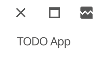
Telling the Go compiler to run "." means it runs all the files in the current directory (main.go for your app). Your app should now look something like Figure 1. Depending on your desktop settings, the app may appear with a light or a dark theme.
Building the User Interface
Before you start building more complex content for your app, I need to explain Container types. Containers are what allow multiple elements to be arranged in an area, and they do so according to a layout. There are many standard containers for common types of positioning in Fyne. You can also add your own layout code. (I won't cover that in this article, but you can find out more online [2].)
These container types include VBox and HBox (for packing child items into vertical or horizontal boxes), Split (to allow users to drag a split bar separating two child items), or Stack (to allow multiple items to be drawn on top of each other). The most popular, and flexible, container is Border, which you will use twice in the to-do list app. The Border container takes four required fields for items to be positioned along the top, bottom, left, and right edges, and an optional fifth parameter for the content that should fill the remaining (central) space.
The app is split into two main areas: the top bar (where you will position the "New item" entry widget) and the to-do list area, which fills the main area. In essence, the app's entire layout is captured as:
container.NewBorder(head, nil, nil, nil, list)
The app uses a new package called container, which is from fyne.io/fyne/v2/container.
To make the top bar, you will use another Border container, which will have an Entry widget for the user input (Listing 3) and a new Button widget using an icon for adding content, which is available in the standard theme. (I will add code to respond to user input later.)
Listing 3
Input Widgets
01 input := widget.NewEntry()
02 input.SetPlaceHolder("New item")
03 add := widget.NewButtonWithIcon("",
04   theme.ContentAddIcon(), func() {
05   log.Println("new item tapped")
06 })
07 head := container.NewBorder(nil, nil, nil, add, input)
Listing 3 defines the app's user interface except for the to-do list in main area.
Buy this article as PDF
(incl. VAT)
Buy Linux Magazine
US / Canada
UK / Australia